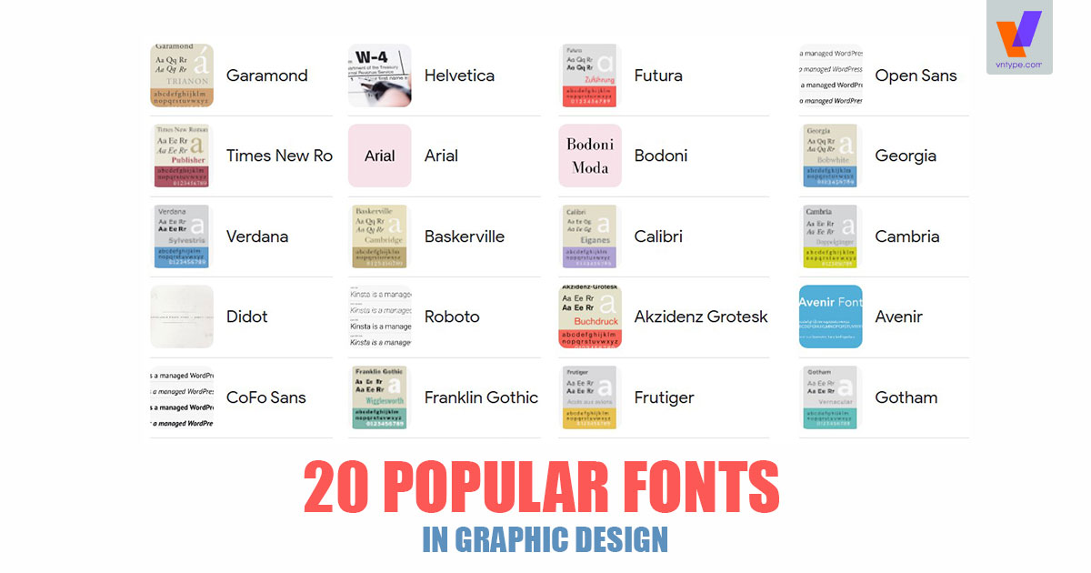
The 20 Most Popular Fonts in Graphic Design
From the traditional and classy serif, to the clean and techy sans serif fonts, here’s the most used typography in graphic design.
Whether it’s fonts for logos, advertisement design, books, or even web design and digital ads as of late, some popular fonts always make the final picks. You’d think the reason for that is that they are free or cheap, but the truth is that they are so well-designed, that they tick all the boxes: legibility, versatility, style, class, flexibility for other alphabets, and glyphs. Here are the best of the best fonts.

Popular serif fonts
Serif typography has an extra decorative stroke at the endings of lines in the lettering and the so-called feet of letters. They tend to be perceived as more traditional and classic since they are the first kind of typography that dates back to the 18th century when old-style typography started being used in print. Companies who use them try to exude a sense of refinement, tradition and respectability as the core characteristics of their brands.
1. Proxima nova
Proxima Nova Sans Serif Font is a strong, versatile geometric sans with industrial quality. It’s designed and shared by Mark Simonson. The result is a hybrid that combines modern proportions with a geometric appearance. Originally released in 1994 as Proxima Sans (now discontinued) with a basic character set in three weights with italics. Rereleased as Proxima Nova in 2005 as a full-featured and versatile family of 42 fonts (seven weights in three widths with italics).
Proxima Nova has been continually updated and expanded since its release. Additions have included support for Greek, Cyrillic, and Vietnamese, numerous currency symbols, as well as a Medium weight for all three widths and italics, bringing the total number of fonts in the family to 48.
Please note that Proxima Nova Sans Serif Font is for personal use only and No Commercial use Allowed! If you want to use this font for Commercial use, you need to purchase a Commercial license here.

